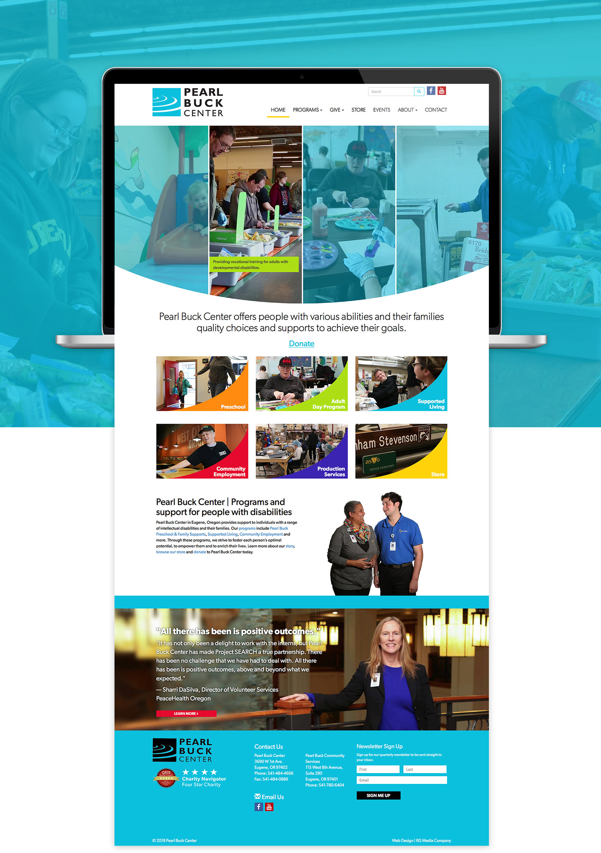
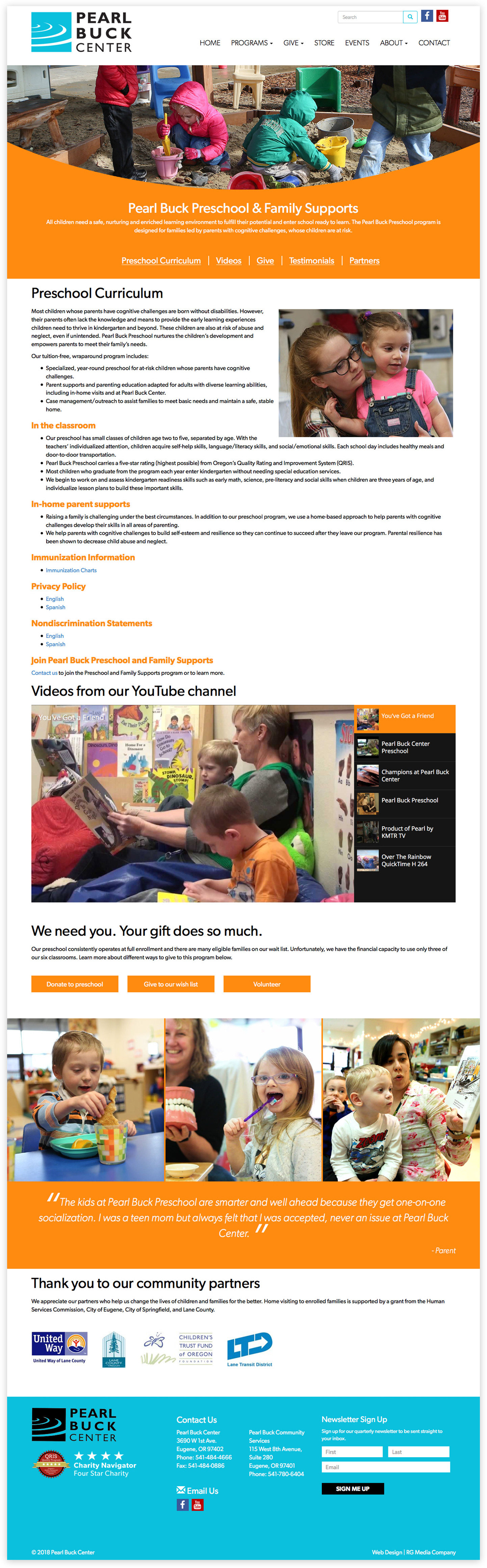
When redesigning their website, I leveraged color theory with photography and videography to trigger users emotions and show the real faces of the people who needed their support. The site also served to break the stereotypes and fear of individuals with disabilities, such as autism and down syndrome. I prioritized this message wherever I could.
A video montage brings the user into the site, showcasing up to four of Pearl Buck Center’s main services. These videos sit in a curved container, which intentionally resembles a smile. This design element is echoed throughout the site and also serves as a connection to the Pearl Buck Center logo.
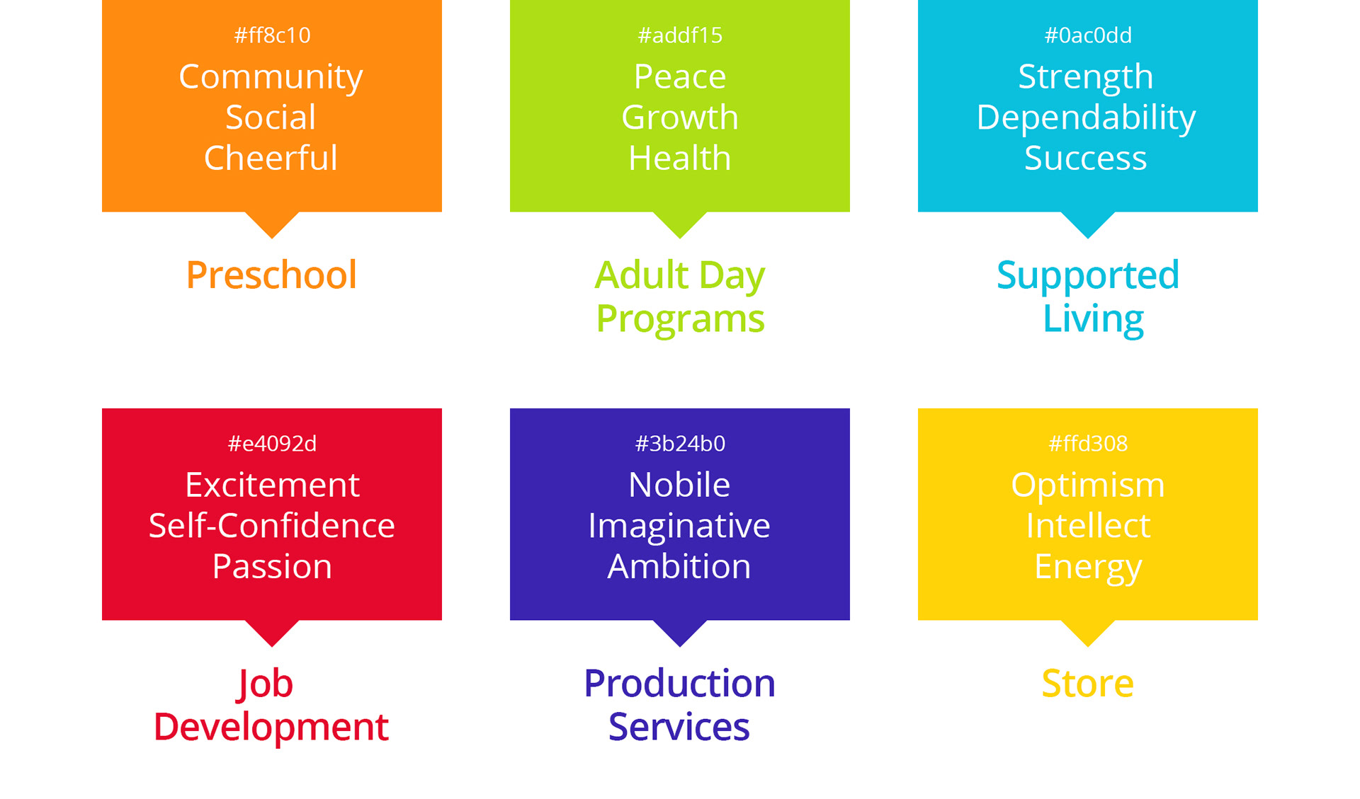
After identifying the physiological characteristics of each color, I was able to assign them to a program.
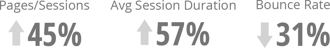
Without access to prior analytics, I chose to measure the success of this site with an industry comparison one year after launch. Industry: Social Issues & Advocacy